Published · Updated
April focused on the work that keeps an Elements project maintainable as it grows: steadier Data Grid rendering, a completed legacy-style migration, earlier feedback from linting, and leaner context for AI-assisted work.
Highlights
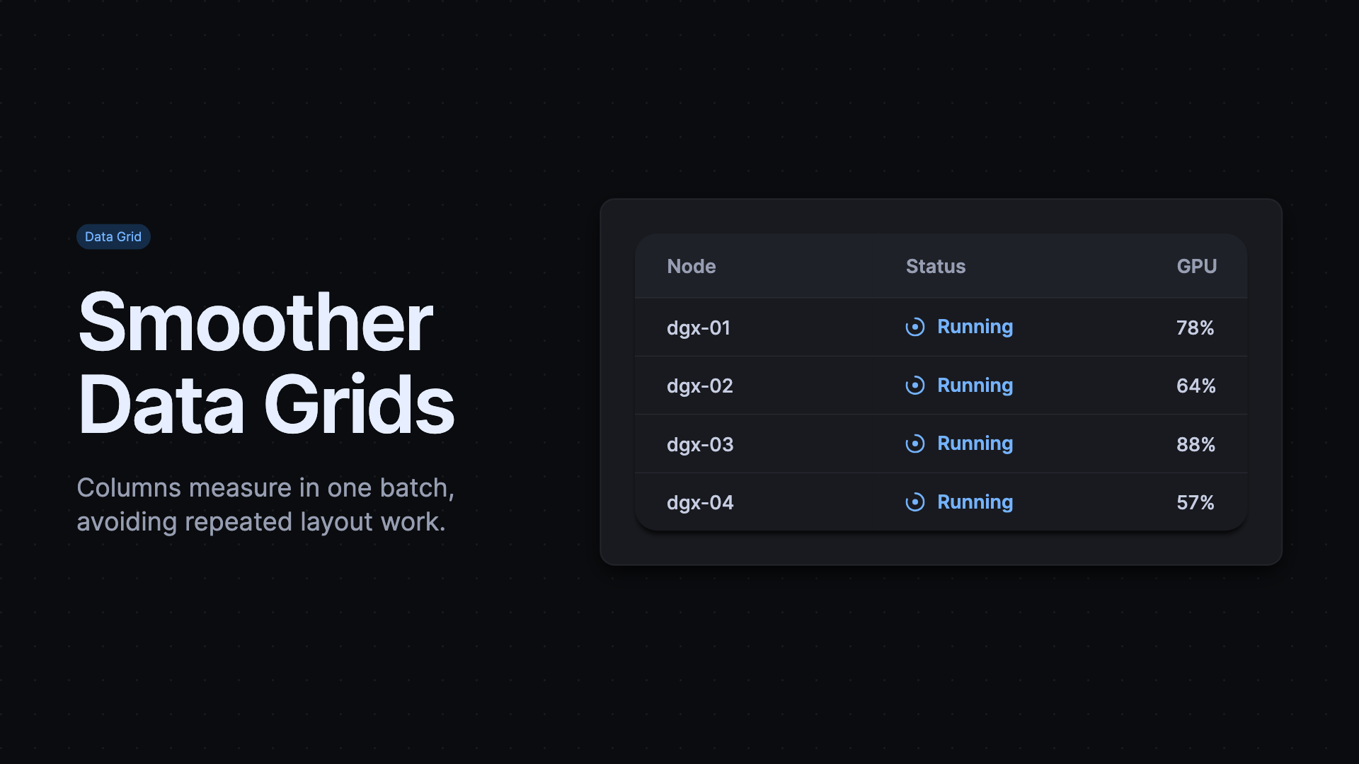
Keep changing Data Grids smooth
When a Data Grid changes columns or renders again, it now batches column measurements before applying widths. That avoids unnecessary repeated layout work in the dynamic tables common to monitoring and management interfaces. Column sizing happens after the grid has a coherent set of measurements, so another render does not repeatedly calculate and apply each change on its own. Core also corrected text wrapping and line-height behavior in compact components, and restored the missing stop icon asset.
Finish the legacy CSS migration
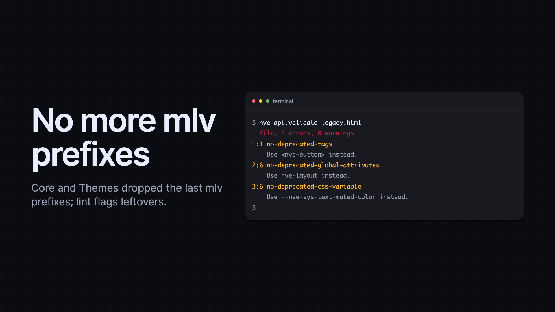
Core and Themes removed the remaining legacy mlv prefixes. This is a broad compatibility cleanup rather than a new API: project styles and component internals now consistently use the current Elements naming. Removing the last old prefix prevents a split between generated theme tokens and component styles, and gives migration tooling one current vocabulary to check. Teams still carrying old copied CSS should use the migration guidance and lint output to identify outdated values before updating dependencies.
Catch composition problems before the browser does
Elements lint added rules for deprecated global attribute values, popovers placed in unsupported slotted content, and Tailwind utility classes on Elements components. These checks make the intended composition model explicit instead of leaving failures to visual review. They are especially useful when a template mixes utility-first CSS with component-level tokens, because the lint result points to the unsupported class before it creates a styling mismatch. The popover rules also gained support for interestfor triggers and Lit boolean bindings, reducing false positives in valid templates.
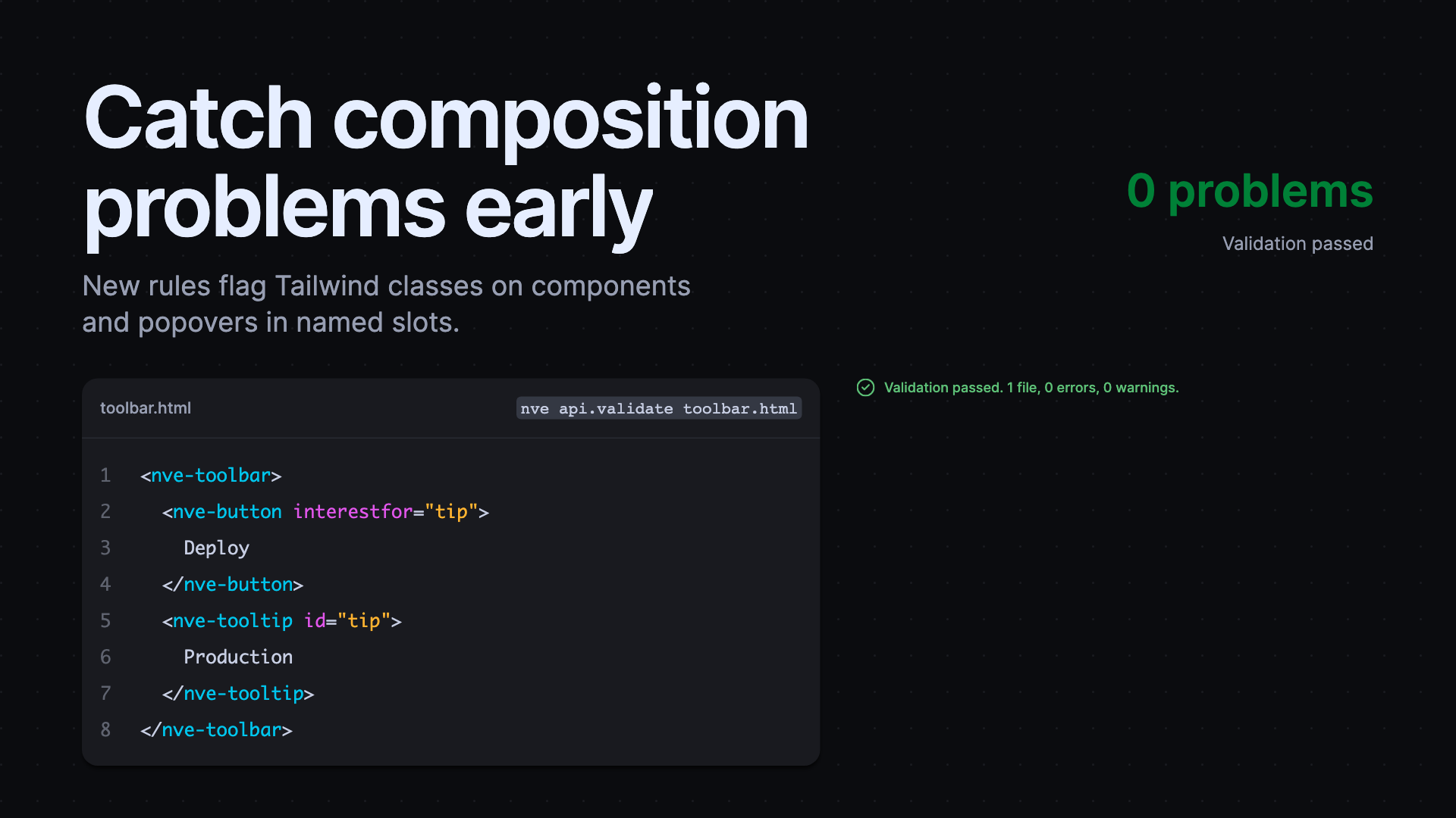
The new rules are available through the standard validation flow:
Give agents focused project context
The Elements CLI reduced the memory used to assemble examples and tool metadata, while tightening package matching, migration links, and version checks. The result is more focused context for an agent or MCP client querying a large Elements project, without changing the workflow developers use.
Released packages
@nvidia-elements/cli0.0.8–0.0.9@nvidia-elements/core0.0.8–0.0.11@nvidia-elements/lint0.1.0–0.1.2, 0.2.0@nvidia-elements/themes0.0.9