Published · Updated
June moved Elements onto its stable 2.0 line. The release removes deprecated APIs, adds reusable form-control foundations, broadens the starter catalog, and makes the CLI easier to install and operate across development environments.
Upgrade to the stable 2.0 line
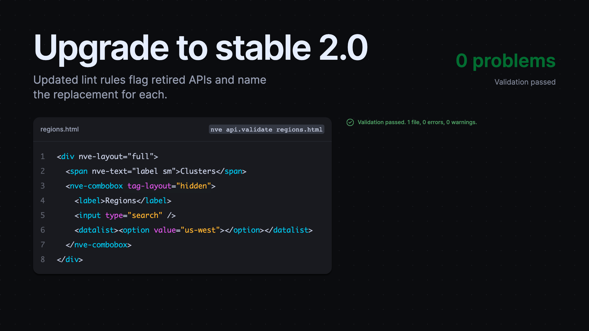
Stable 2.0 releases landed across Core, Forms, Themes, Styles, Lint, Code, Markdown, Monaco, and the CLI. The upgrade deliberately removes deprecated component and style APIs, so review the migration guide before changing versions. This is the release to use when a project is ready to finish its migration rather than retaining compatibility shims. Updated lint rules identify retired tags, attributes, slots, popover settings, CSS custom properties, and package imports while the CLI supplies matching migration context.
Build controls from shared behavior
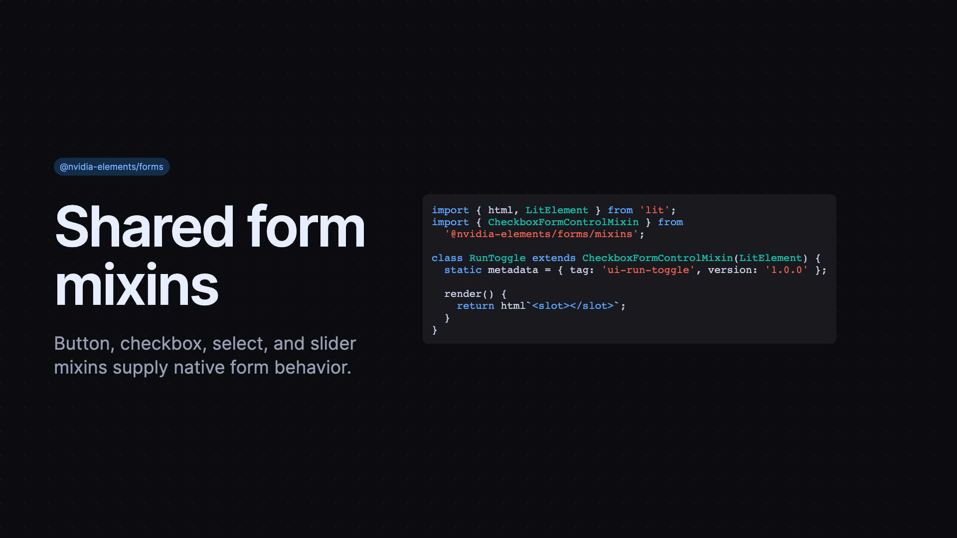
Forms now provides reusable button, checkbox, select, and slider mixins. They combine native control behavior, state reflection, validation, command handling, and popover interactions so component authors do not have to write those details again. The mixins let a custom control start from shared keyboard, state, and form behavior while still supplying its own rendering and API. Follow-on fixes improve ARIA state management and property/attribute reflection, especially through resets and reconnection.
Start the right kind of project
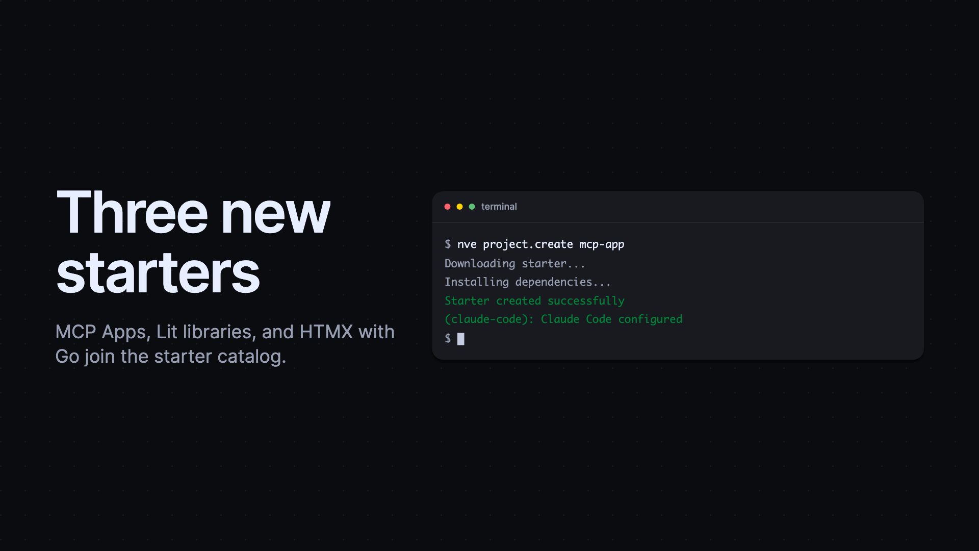
The starter catalog now includes MCP Apps, Lit libraries, and HTMX with Go. The Go starter also corrected CDN loading and simplified its server setup. Create a project from the terminal, then select the starter that matches the app or library you are building:
Install and run the CLI reliably
The Elements CLI added a PowerShell installer for Windows and strengthened shell installation, version checks, updater behavior, build approvals, and error feedback. The CLI is friendlier in automated and non-interactive environments as well, where a missing approval or an unexpected prompt should result in an actionable message. Core matched that release with lifecycle fixes for scoped registries, native popovers, control resets, and connected-callback observers, keeping production interfaces stable as browsers and apps change.
Released packages
@nvidia-elements/cli0.3.0–0.3.1, 2.0.0–2.0.1, 2.1.0–2.1.3@nvidia-elements/code2.0.0–2.0.1@nvidia-elements/core0.2.2–0.2.4, 2.0.0–2.0.2@nvidia-elements/forms0.1.0, 2.0.0–2.0.1@nvidia-elements/lint0.4.0, 2.0.0–2.0.1@nvidia-elements/markdown2.0.0–2.0.1@nvidia-elements/monaco0.0.12, 2.0.0–2.0.1@nvidia-elements/styles0.0.10, 2.0.0–2.0.2@nvidia-elements/themes2.0.0