Published · Updated
October brings directional input, more control over spatial navigation, and reusable building blocks for workspaces, backed by earlier feedback on invalid templates. This update covers releases through October 29.
Before you upgrade
Viewport moves out of Core into @nvidia-elements/viewport. Install the new package and replace Core Viewport imports with its component entrypoints: @nvidia-elements/viewport/viewport/define.js, @nvidia-elements/viewport/gridlines/define.js, and @nvidia-elements/viewport/minimap/define.js. Core no longer bundles these components. Viewport also replaces the earlier pan and zoom proposal APIs with Invoker commands; use viewportchange to observe committed transforms. Viewport remains an evolving API.
Highlights
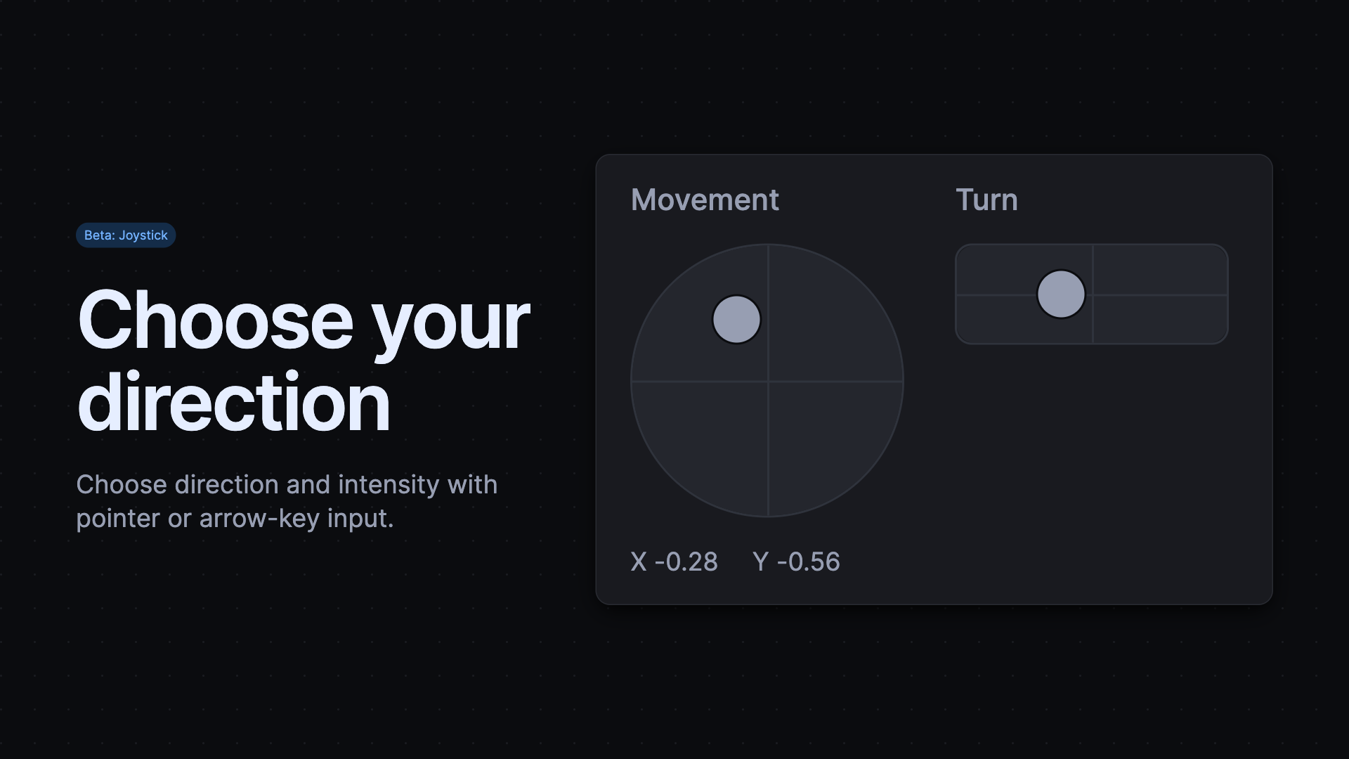
Choose Direction and Intensity with Joystick
The new Joystick accepts pointer or arrow-key input and returns normalized coordinates from −1 to 1. Choose circular, square, or single-axis constraints, and let the control return to center or hold its last position after release. Read-only mode displays recorded positions. Applications map these values to their own units and commands, making the component useful for robotics interfaces and simulations without prescribing a control system.
Navigate Spatial Views with Shared Controls
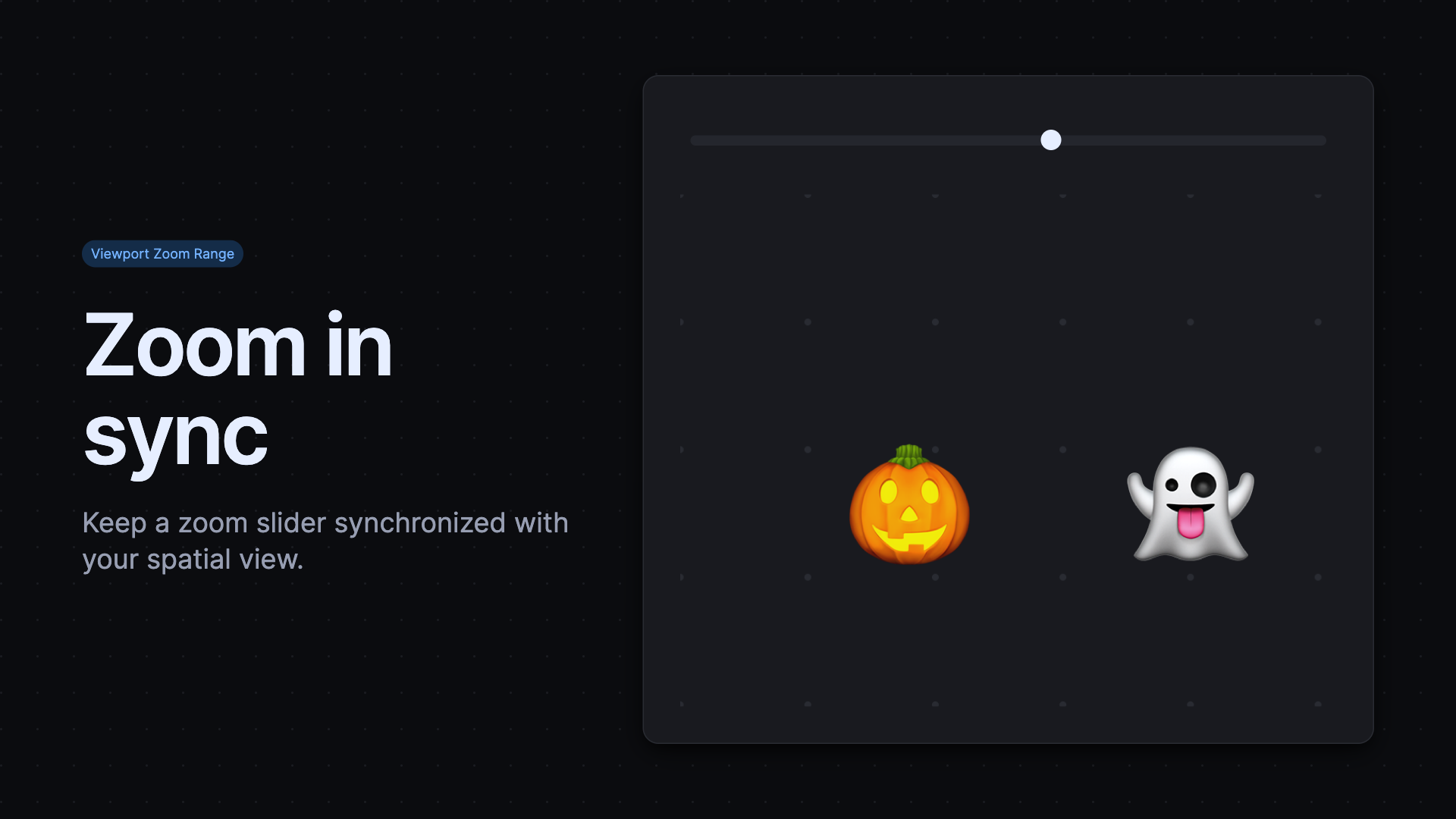
The new Viewport Zoom Range connects a slider to a viewport through commandfor, keeping zoom controls synchronized with the view. Configure zoom-stops for meaningful scale steps, and use --pan-to and --zoom-to commands for custom navigation controls. Gridlines adds dot and cross patterns alongside lines, so diagrams can use a quieter spatial reference. Accessories now connect correctly even when applications import them separately.
Put Actions Beside Workspace Navigation
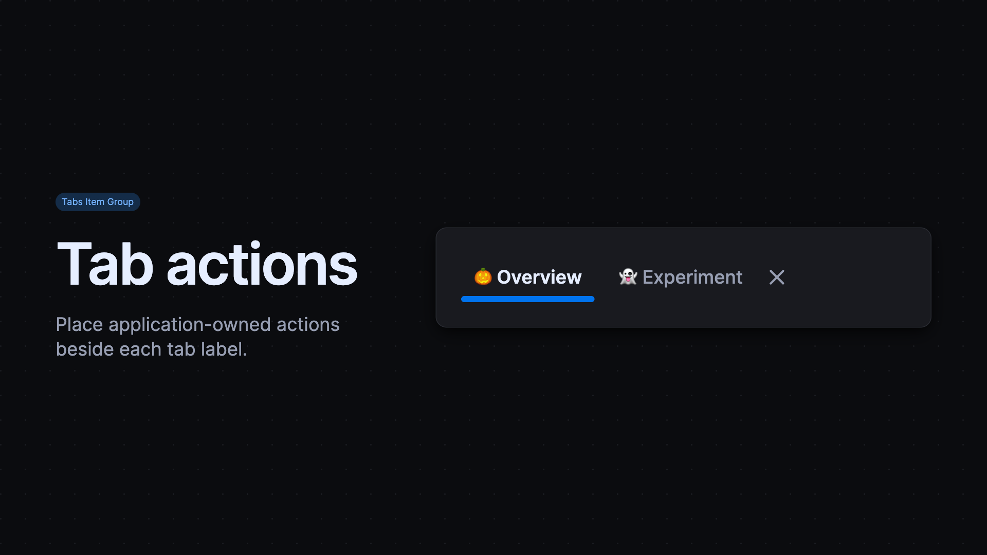
Tabs adds nve-tabs-item-group to place application-owned controls before or after a tab. A close button or actions menu can sit beside its label without becoming part of the tab itself. Arrow keys focus tabs; Tab reaches their accessory controls. Applications handle closing and other actions.
Tree gains prefix and suffix content, link targets, and Invoker command support. Icon Button now supports icon appearance selection.
Embed Generated Content with Iframe
The new beta Iframe component renders template content in a separate document, making it useful for generated UI, live previews, and embedded examples. It synchronizes the parent theme and adjusts its height as content changes. Supply the body in the default template and styles, fonts, or component registrations in a template with slot="head"; iframe documents do not inherit those resources from the parent page. Iframe shipped in Core 2.16.0 on October 22.
Follow Growing Content with Scroll Box
The new Scroll Box keeps the latest text visible as an AI assistant streams a reply or a log gains new entries. Optional edge shadows show where more content is available. In follow mode, scrolling away pauses following so people can read earlier content. It ships in the new @nvidia-elements/foundations package, which also exposes shared internationalization support for component authors.
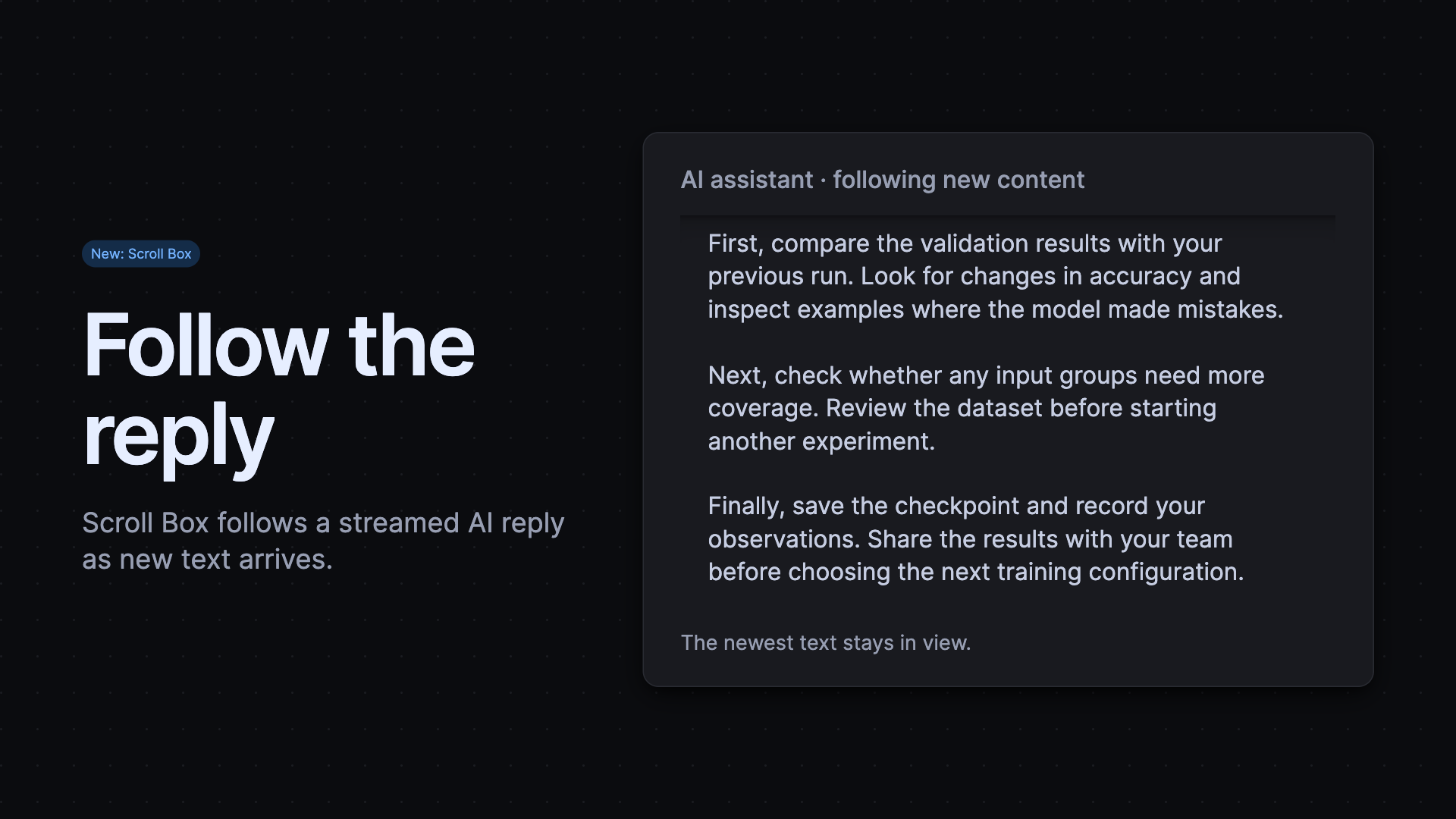
Append incoming response fragments inside the container. Scroll Box follows the growing content without application code setting the scroll position.
Show Ongoing Work with Progress Dot
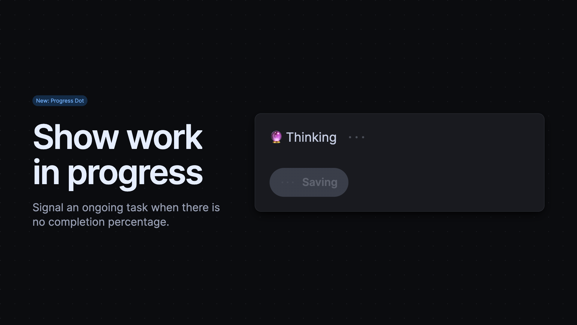
Progress Dot adds an animated loading indicator for tasks that have no completion percentage. Place it beside a thinking message or inside a busy button, and give it an accessible name when it conveys status on its own. Small, medium, and large sizes fit different layouts.
Give Movable Items a Drag Handle
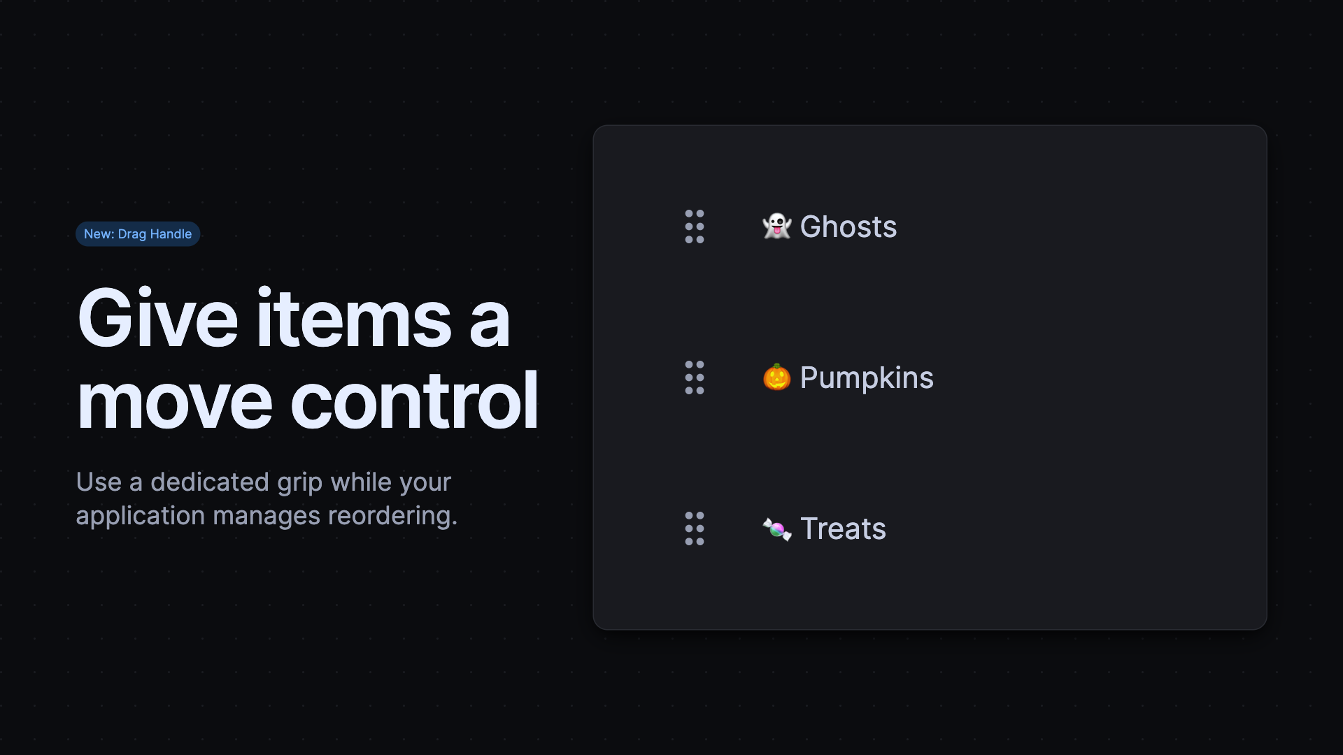
The new Drag Handle gives movable items a dedicated, labeled grip. Its pressed state marks an item selected for movement, while disabled state keeps unavailable controls visible. Applications manage the movement and reordering, so the same handle can support task lists, workspace panels, or other movable content.
Repeat Playback or Keep Video in View
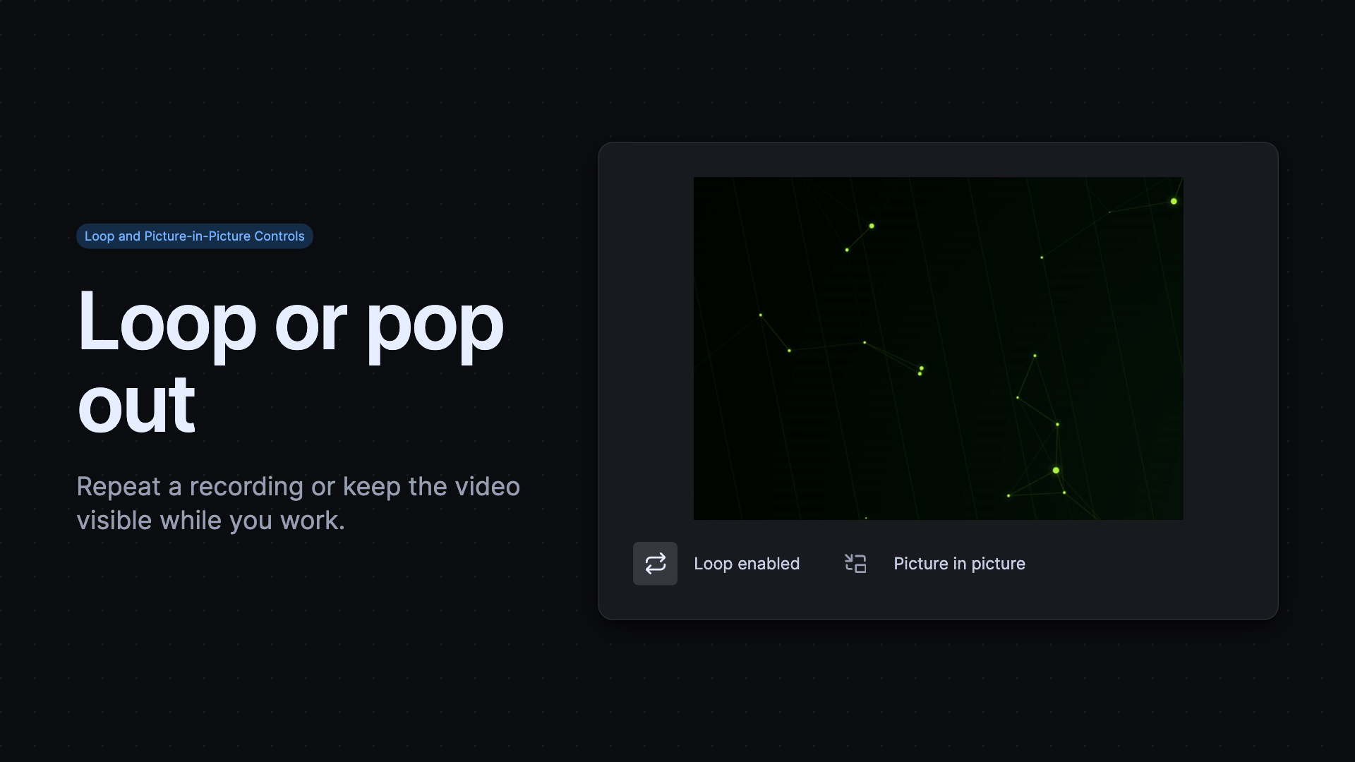
New Loop Button and Picture-in-Picture Button controls connect to a Media Controller through commandfor. Loop repeats a recording until users turn it off. Picture-in-picture lets users keep a video visible while working in another window when the browser supports it. Controls reflect the connected video's state, including looping enabled in native video markup.
Catch Template Problems Earlier
New lint checks catch nested interactive elements, unsupported component parents, more than one page shell, invalid numeric and date values, and invalid formatting options. Popover guidance warns about excessive instances. These checks help authors and agents find mistakes while editing templates.
Elsewhere, Monaco integration updates to editor 0.57.0. Fixes improve panel stacking, grid keyboard handling, form label detection, filter-chip sizing, and closed popover layout. Documentation examples also preserve their source more reliably.
Released packages
@nvidia-elements/cli2.2.9–2.2.14@nvidia-elements/code2.2.0, 2.2.1@nvidia-elements/core2.11.1, 2.11.2, 2.12.0, 2.12.1, 2.12.2, 2.13.0, 2.14.0, 2.15.0, 2.15.1, 2.15.2, 2.15.3, 2.15.4, 2.15.5, 2.16.0, 2.17.0, 2.17.1, 2.18.0, 2.18.1, 2.18.2, 2.18.3, 2.18.4, 2.19.0, 2.19.1, 2.20.0@nvidia-elements/forms2.0.7–2.0.10@nvidia-elements/foundations1.0.0, 1.0.1, 1.0.2, 1.1.0@nvidia-elements/lint2.7.2, 2.7.3, 2.7.4, 2.8.0, 2.9.0, 2.9.1@nvidia-elements/markdown2.0.4@nvidia-elements/media1.1.0, 1.2.0, 1.2.1, 1.2.2@nvidia-elements/monaco2.1.0, 2.1.1@nvidia-elements/pi1.0.1–1.0.3@nvidia-elements/viewport1.0.0, 1.1.0–1.1.4